Les formations IA d’Aqsone
Adaptées à la maturité IA de votre entreprise.


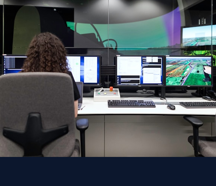
Aqsone Academy : L’excellence pédagogique au service de l’IA industrielle
Alliez exigence métier et savoir-faire technologique. Certifié Qualiopi depuis 2022, Aqsone Academy met à votre disposition l’expertise terrain de formateurs confirmés.
Plus qu'un centre de formation, nous sommes un partenaire de confiance pour sécuriser la montée en compétences de vos collaborateurs et garantir le succès de votre transformation numérique.

Formations IA adaptées à votre maturité
Les formations IA Aqsone sont conçues comme des parcours personnalisés, adaptés à la maturité IA de vos équipes. Théoriques et enrichies de cas pratiques réels, elles sont dispensées par des formateurs expérimentés, en conformité avec la certification Qualiopi.
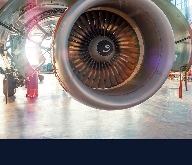
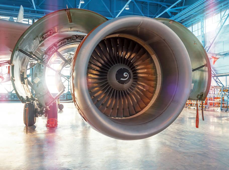
IA pour les métiers de l'industrie
Découvrez l'IA appliquée à vos opérations, des achats à la maintenance !
Sensibilisation à l'IA
Fondamentaux pour démarrer sereinement, avec exemples sectoriels.


Formations Palantir
Maîtrisez Foundry et AIP pour gérer et exploiter vos données industrielles.
Introduction à Palantir
Sensibilisation aux plateformes Palantir Technologies pour l'industrie.


Montez en compétences sur l'IA industrielle
Découvrez nos parcours de formation conçus pour aligner vos équipes sur les enjeux de demain. Acculturation stratégique ou maîtrise technique, nous vous transmettons les clés pour piloter vos projets IA avec autonomie, sécurité et pragmatisme.
